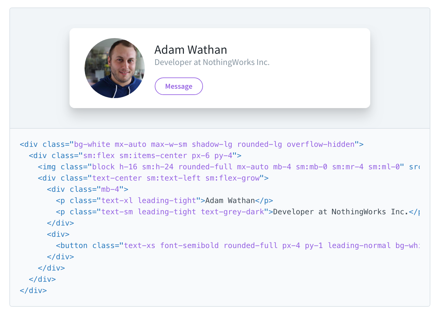
"Cards" are a fantastic, somewhat recent, and time-tested trend in web design that come with a host of benefits that has contributed to this trends proliferation throughout the web and application design. While I won't claim to be a seasoned web design expert, I know enough to be dangerous and recently worked through a "card" redesign that warranted sharing.
Cards?
Perhaps without even realizing it, you've been using cards for quite some time each time you access your favorite sites and apps. Any element that acts as a "container" with its own "record" is considered a card. Any data type that can have multiple records is a good candidate for a card. For example, comments, contacts, status updates, just to name a few. Generally any plural noun can make a card.
Without diving into the details, there's a few key benefits to cards in web design:
- Self contained, clear separation of data
- Increased operability of data (cards can be "acted on")
- Very scalable; use the same design across desktop and mobile
- Better space utilization; cards can help favor vertical length on mobile devices
In my case, I'm working with financial data, namely stocks, or stocks within a portfolio or watch list.
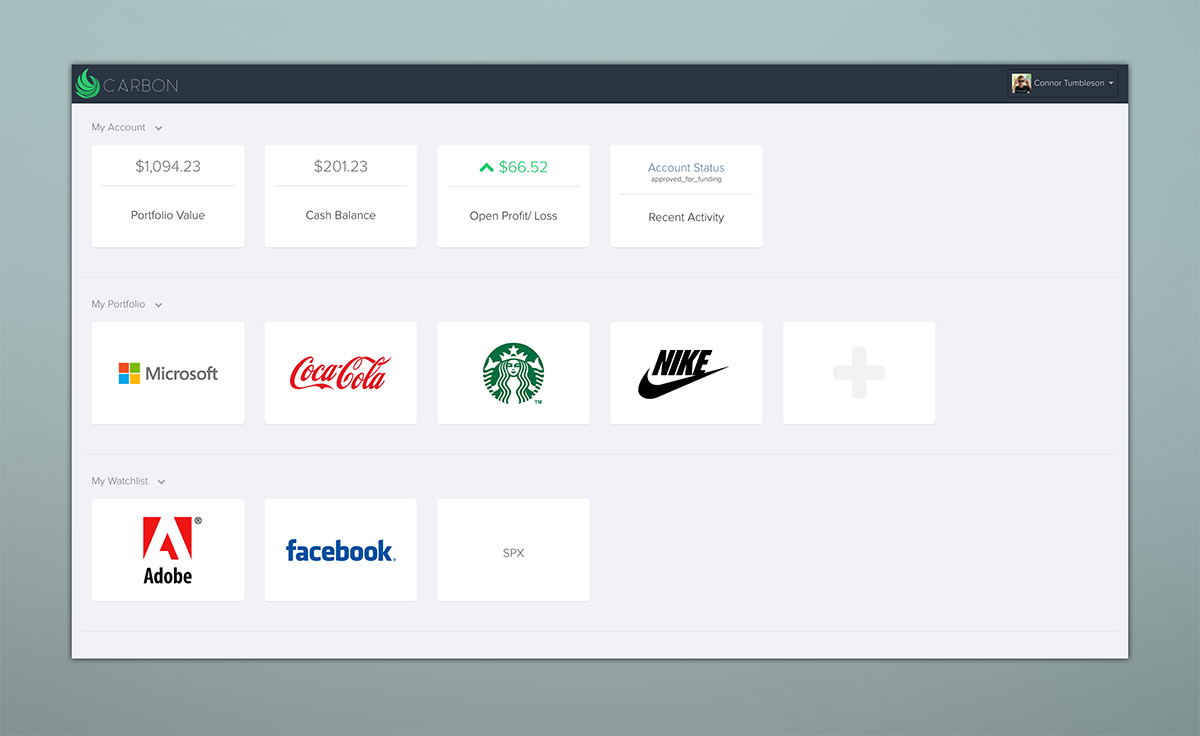
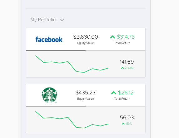
Above is a mockup I did for Carbon awhile back. Around the time I was designing this, Robinhood was starting to take hold amongst millennials, and I think for the first time in a long time, they had made finance beautiful. Not looking to invent the wheel, I set out to design the simplest finance platform ever. Even children can understand the concept of the stock market, so why is it that current offerings provide you tools that are literally overkill for what the first time investor needs.
It was this premise that guided my early design. My thought being, how simple can I make it to view my portfolio and my watchlist? I started by designing some header cards (see the "My Account" tiles), then tiles representing stocks, using swim lines to indicate their ownership (watchlist versus portfolio).
While your first thought might be how little information is actually visible on this page, there was one hidden trick: each of the cards could be "flipped" on a mouse hover to reveal a backside. In the case of stocks, there was a little more detail about the stock, the current price, daily change (%), and a quick chart/ sparkline:

Nifty right? Unfortunately "cool" doesn't translate to great usability. Here's why this was a bad idea:
- Relying on "hover" to show more detail is a bad idea since it limits the usability primarily to desktops. Yes, you can trick mobile devices to do "hover", but the experience is never as smooth.
- I'm purposefully increasing the work a user must do to view their own information. What value is a simple logo on the front side?
- Since each card is self-contained, there is no way to view the status of multiple together, defeating any "at a glance" value.
What information do I need?
The driving premise behind my redesigned tiles was to revisit some of the core tenants of UI/UX design: who is using this, why, when, and where?
This is pretty straight forward: anyone using the application to view the status of their current portfolio of stocks, as well as the status of those in a watchlist. These cards will make up the "homepage" and will be one of the most visible elements of the entire application.
What information do I want to see for a stock tile?
Core Elements
- The stock name/ logo. This might as well be the "primary key" for the card, and consistent with one of the missions of Carbon (make finance simple), I strongly believe adding visual identities to the stocks (e.g. logos) make them far more approachable. Most first time investors aren't buying faceless ETF's or bonds, so the scenario wherein a logo doesn't exist is rare.
- The current share price. This is one of the core things you'd want to see about a stock, regardless of if you own it or are watching it.
- Percent change. In many cases, just knowing the price isn't good enough - you really want to understand the change from the last price so you have bearings about if the stock is doing well or not on that day. Finance typically represents this change as a percent from the previous days close.
Secondary Elements
- Current position (dollar or percent). If you own a stock and it's in your portfolio, you might be most interested in knowing what it's currently worth. Since "value" is equal to shares owned * current price, then showing the actual value allows you to forgo needing to show this math. Similarly, a percent change (while arguably the most valuable from a scannablity perspective), suffers from not having a consistent frame of reference. This is pretty easily overcome by doing a percent change from the previous day, but since (as first time investors), we don't want to unnecessarily scare our users, this percent change could be very misleading (e.g. a stock down 5% one day but up 10% for the week is still doing great, but you might not know that if you only saw that one day decrease).
- Change over time. Stocks move a lot. Just like I explained with viewing a percent change over a single day, investors may wish to know how a stock is doing over a broader time horizon, such as the past month, or year-to-date. This element is actually the most detailed since it's no longer one data point, it's many - a time varied series likely manifested as a chart.
Version 1
As it turns out big logos aren't really necessary, so I took my tile and broke it into thirds. Additionally, based on the above, I know there are really two different tiles I'm trying to design, but it would make sense that they share many of the same elements. If you owned the stock, and thus is was in your watchlist, it might look like this:
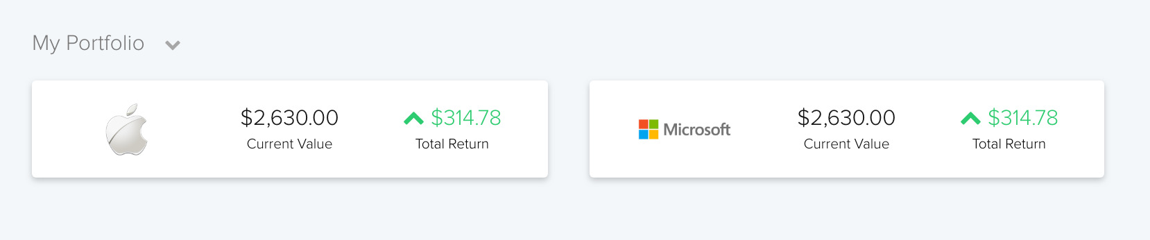
- Left: The visual identify I spoke about above. I assume if you own the stock, you very likely remember buying it, and have some sort of vested interest it. As such, I'd expect that after doing your research to purchase the stock, you'd be able to consciously match the logo with the company, without a name.
- Middle: Although this is a "secondary" element, it's arguably more important that the current price, since the current price is directly proportional to your value (equity) in the stock.
- Right: showing the "total return" as a dollar change really helps to add a tangible element to the ownership of that stock. Instead of knowing you're up 10%, a first time investor might take more satisfaction and derive more value in knowing they were up (or down) by a certain dollar amount. Adding color and a chevron helps add depth and scannability to this tile.
Similarly, the tile would change if it was in your watchlist (meaning you don't own it). There are a few small distinctions:
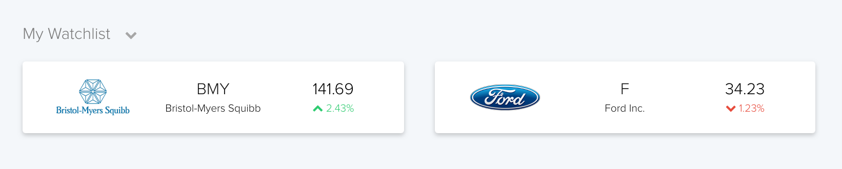
- Left: A visual identity is just as important so the stock logo remains on the far left.
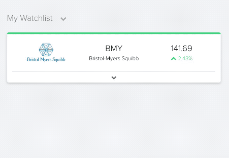
- Middle: Since you don't own this stock, and some companies don't have immediately recognizable logos, I felt it important to include the name of the company (stock), with its ticker symbol. While the ticker symbol (e.g. BMY for Bristol-Myers Squibb) isn't actionable, it helps bring some common finance elements to the surface.
- Right: Finally, we can pair together the other two core elements: current price and percent change. Using a little color for the change and a simple chevron helps with scannability.
Version 2
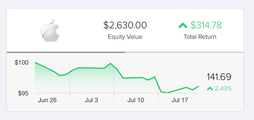
I'd like to focus on the stock tile that appears when your own a stock (in your portfolio), or my first graphic above. Of the elements I described above, I'm currently missing the current price, a percent change, and a change over time. Since the last element necessities a chart, I can't really rely on the natural "thirds" separation. What if the chart got two thirds and I stacked the remaining elements like I did previously?
Here I added a sparkline chart and added the current price with a percent change (just as I did in the watchlist tile). I also added a very slight gray "status bar" between the two elements. In this case, it's at exactly 50%, but I foresee this working well as a visual indication of time left in a review. Don't worry if this doesn't make any sense in the context of this; just think about if you knew you wanted to revisit your ownership of each stock, say every 90 days (say you wanted to rebalance, reconsider position, etc.). This simple progress bar would count down, so without even seeing a number, you could quickly know how long it's been since you last revisited that stock.
I like this iteration, but the sparkline is somewhat weak. The time series isn't clear (X axis), nor is the actual variance of this stock (Y axis). I can reasonably assume the last value (far right of the line) must be equal to the current price, but I have no concept of what other points on the line are.
Version 3
In this iteration, I added scales, and a simple grid. This same line is immediately much more valuable (disregard the dummy data). If you're curious, I'm using Chart.js as my charting library for this. While I never wired up any real dynamic data, I did code the look and feel of this chart, including the subtle fading of the grid, under the curve, and the feel of axises.
This still is missing one thing - what if I want to change the time scale of the chart?
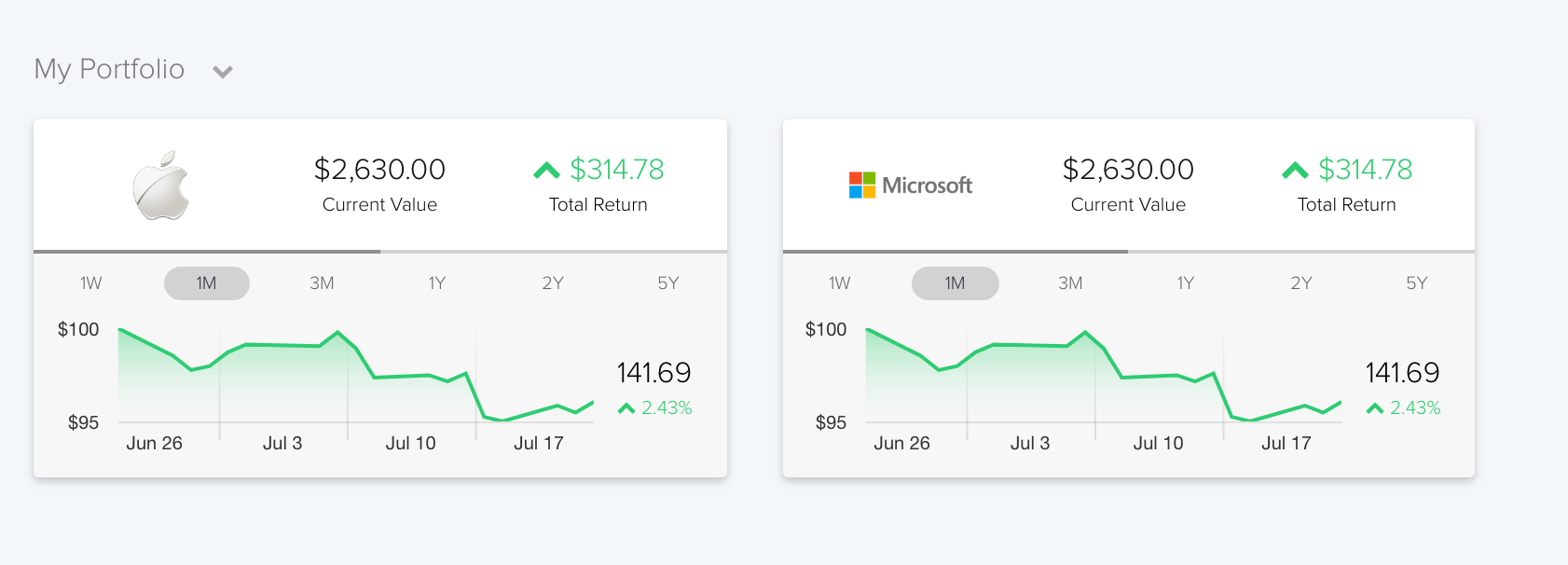
Since vertical space is much more plentiful that horizontal, it's easy enough to tack a few time-series buttons on here.
Clean-up the Watchlist Tile
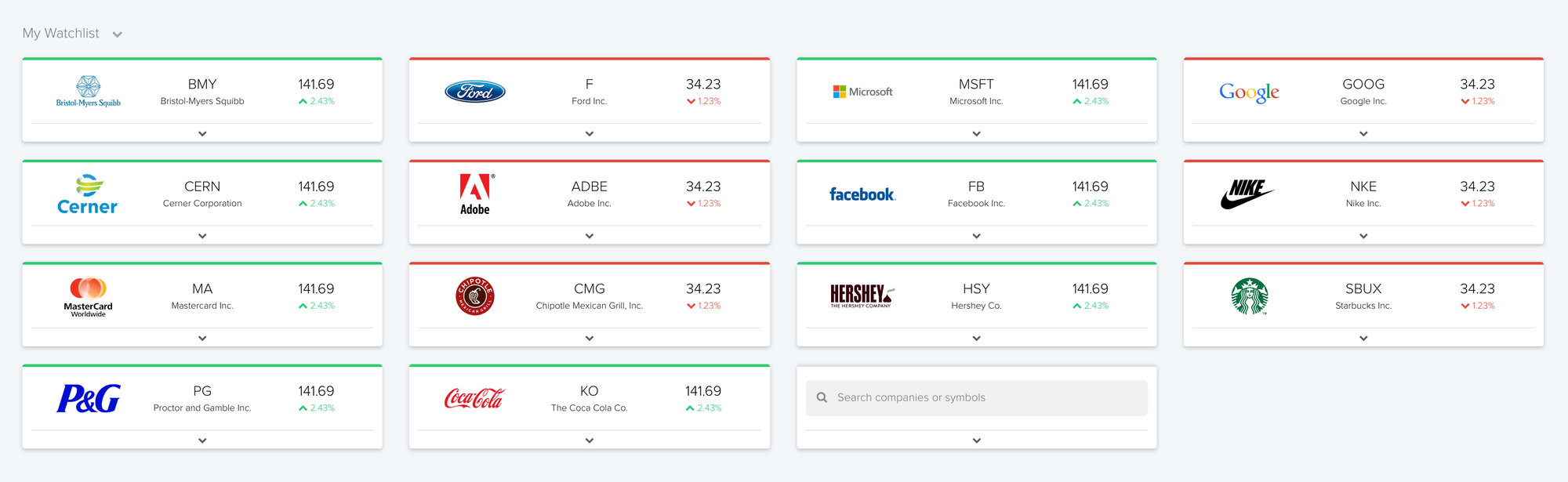
Last on the agenda is to bring some of this same thinking with the chart to watchlist tile. Although in this case, we're talking about a very different type of stock here. While a user's portfolio will likely stay under eight stocks, or two rows with four each (and I think even that is high for the first time investor), a users watch list could easily hit two or three dozen. Can you imagine a page with seven or eight rows of charts?
What if we collapsed the chart under a drop-down arrow?
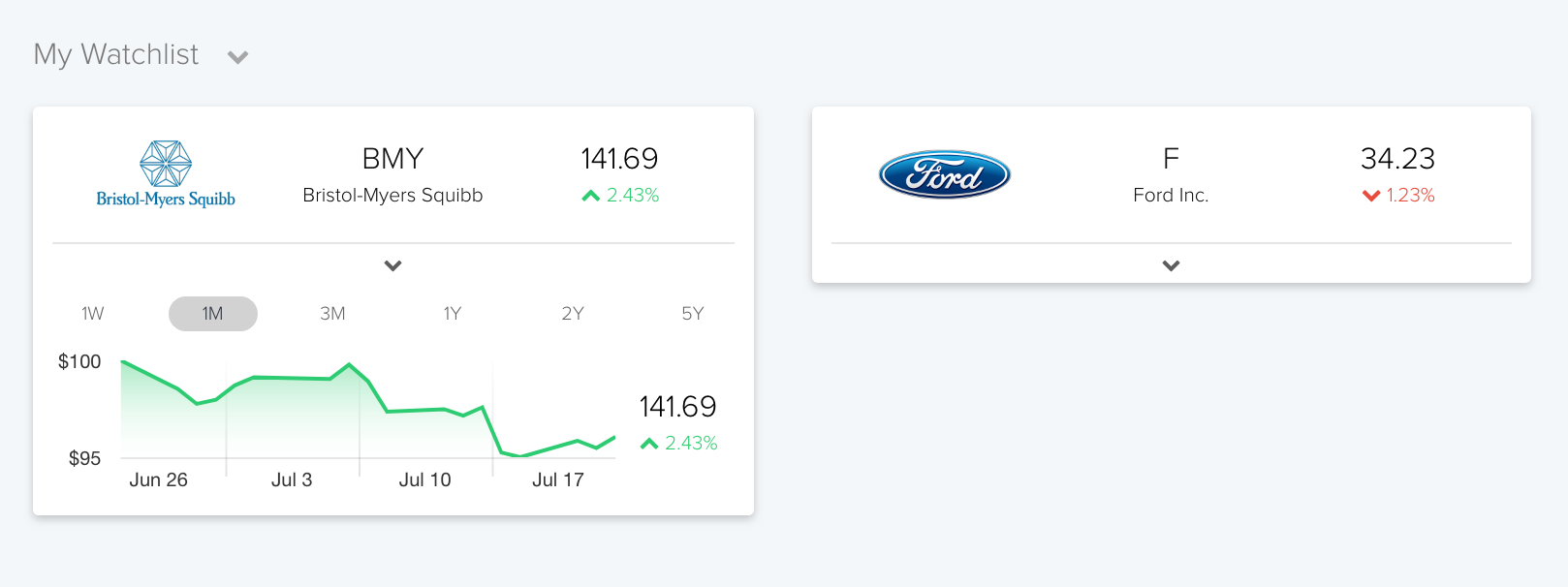
Now we get the same benefit as the full portfolio tiles, but we can tuck it away under a simple carrot, revealing only when needed. As an added touch, I've added a top border to the tile so it's even more immediately scannable as to that days status. Here's that whole process:
This approach has the advantage of being to show a lot of tiles, without feeling too cramped. Here's a quick mockup with a watchlist with 14 different stocks (disregard the dummy data on the numbers):
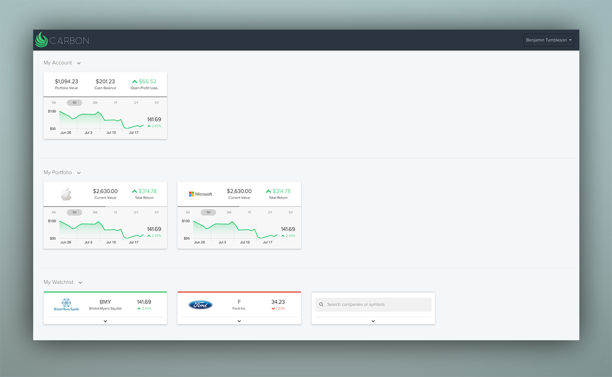
And bringing it all together once more:

Member discussion: