I'm confident that I'm not the only person who has sunk a lot of time into designing these that may never be seen. More specifically, think about the natural flow of applications, the "happy path" if you will. Design those the first time around, but any unexpected error page or action probably doesn't deserve your attention for a V1 release, or especially a beta.
Here's a good example: in Carbon, a financial application, stocks can be "inactive". The most common cases of this is when a company has been acquired or merged with another. Mind you this is rare at the Fortune 500 level, but it does happen. In these cases, I'd prefer not to just delete all the data I have on that company, it just needs to be put into an "archive" state. There already exists logic to "deactivate" the stock so that it won't attempt to pull new prices, etc., but to an end user, the only indication you might have is looking at the recent news citing a merger.
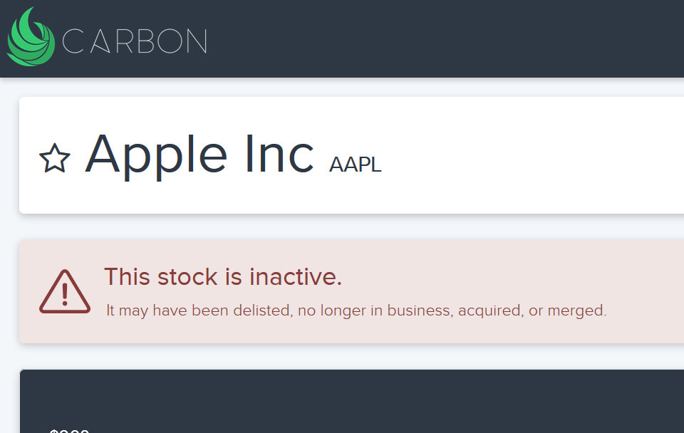
So I built this, a simple warning header that appears when a stock is returned from my database with isActive = 0. I regret this took me a few hours to get the colors, font, and icon just right. It's not perfect, but I hit a point where I went no one is ever going to see this. Don't fall into this trap.
Caveat: this is not to say you shouldn't eventually design for edge cases. Odds are though, at the time you're building an application, with zero users, it's an inefficient use of time for minimal value, since the odds that anyone will see what you've designed is very low. It's also not the end of the world if your user flat out hits an generic error page. Turns out when people derive value out of your app, it's not the end of the world when one small piece wasn't as user friendly as it should be by the time you're a VC-funded company.
Last note: attention to detail, even the small things, shows thoughtfulness in design. Though the point above remains true, if you're interested in a few examples - LittleBigDetails has you covered.
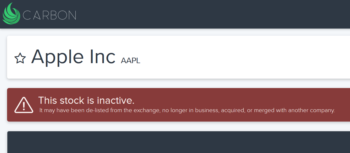
Edit: I ended up inverting the colors here. Thought it would carry more "punch" when exactly 0 people run into this warning.

Member discussion: