
It can be easy to become blind to the amount of engineering that goes into websites and applications that seem so simple in premise. Google Search, uploading a photo to Facebook, sending a Snapchat, liking a tweet. All actions that happen thousands of times a second, and yet none of these services skip a beat. Yet behind this simple action is a herculean effort of engineers, designers, developers, and product teams that make it work seamlessly. It's this concept of invisible engineering that is so fascinating to unbox.
Case Study: Google stock price results
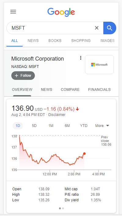
This feature with Google has been around for years, but it wasn't until I built my own stock chart that I realized the number of challenges engineers had to solve to make such a straight forward feature work. I wanted to review a number of those briefly:
Frequency of data (interval)
Do you notice how you Google gives you a handful of time range options (e.g. 1 day, 5 days, 1 month, etc.)? Simple concept, but it's not as easy as simply returning more data from the database. Consider this: when you're looking at the "1D" option, Google is showing you stock price data in 5 minute intervals. Given the markets are open 6.5 hours a day, that's approximately 85 data points. If you kept that same 5 minute interval with 5 days, that's 425 data points. On a phone screen that's no more than maybe 3" wide, that's a lot of dots. Go one step further - consider 1 month with 5 minute intervals = 1700 data points.
Google has obviously thought through this and has assigned different intervals of data that should be returned based on the overall range selected. For example, a 1 day range gives you 5 minute ticks, 5 days gives you 30 minute ticks, and 1 month gives you daily ticks. When you select a new period, you can see the async request that tells the API what interval of data it wants:
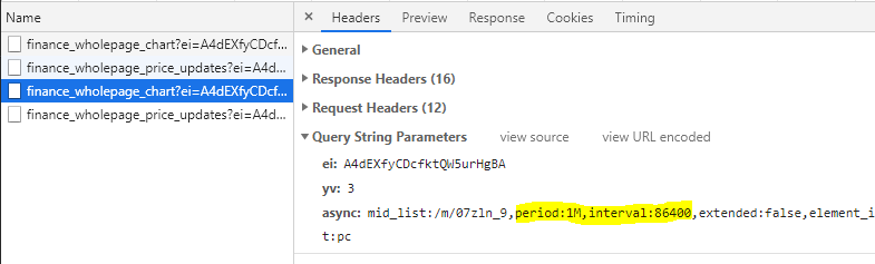
Does 86400 sound like a familiar number? Turns out that's the exact amount of seconds in a day. So when the period = 1M, then return all of the associated data that is 86400 seconds apart from the last (1 day). This also gives us clues into how financial data is stored in Google databases.
Data Structures (database considerations)
I won't pretend I know what Google's infinite database of financial data looks like, but I'll make this realistic using my own mini-financial database, which might as well be a spreadsheet.
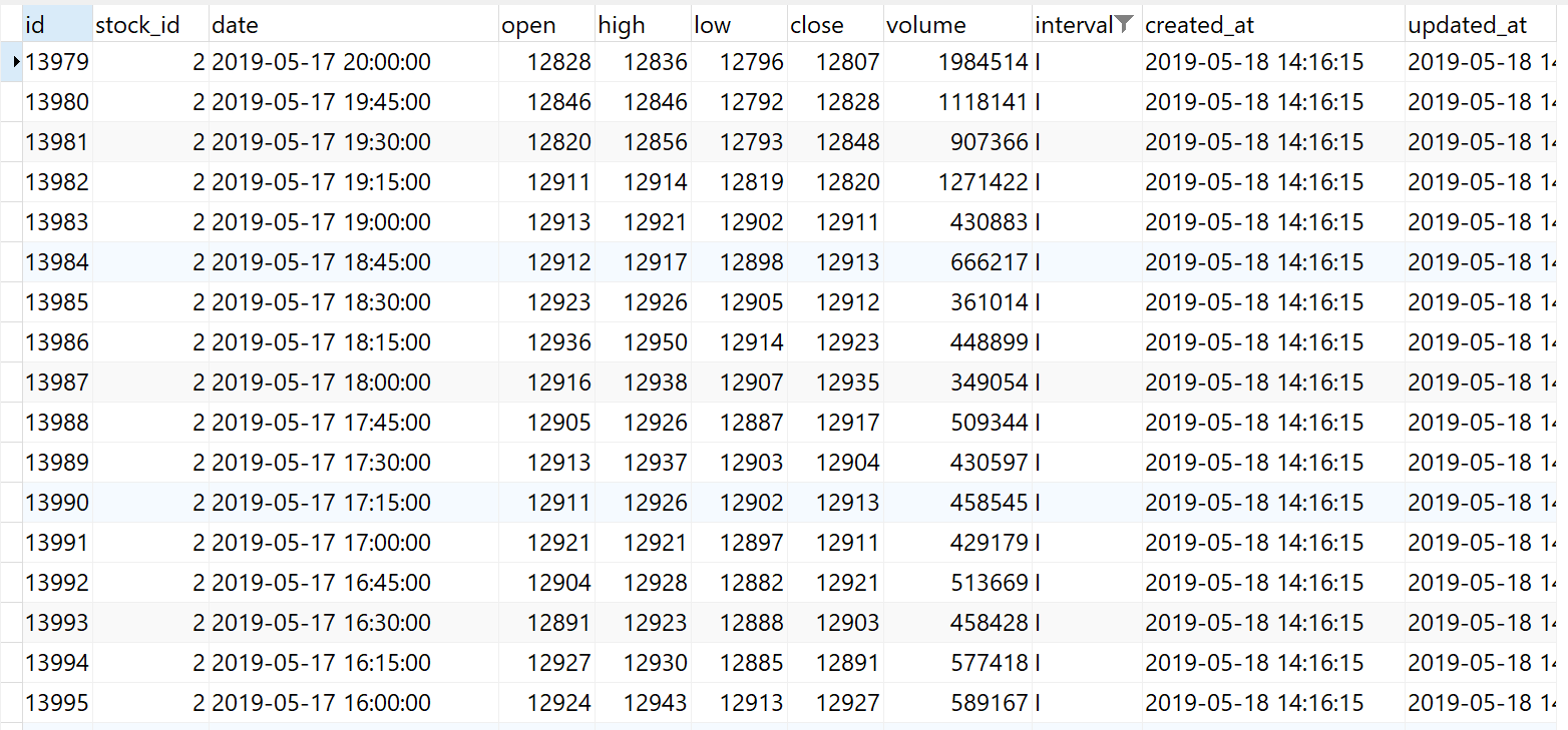
When you're storing financial data, you have to consider what kind of information you need. In the case of Google's chart above, it's just price and time (X and Y), so there isn't the need for volume data, though you can see why it might be valuable to have this information in the future. Volume itself is an "instantaneous" value like price is. If someone asked you what the volume of MSFT was at 2:30PM ET on Friday, August 2nd, it might not be immediately clear if that user wants the volume since the last interval (which would make sense if you were showing bars with underlying volume information), or if they want the sum of that volume since the open. While both are ranges, one is dependent on the interval of the data, and one is the sum of all of the volume from the start of that day. While somewhat mundane, as a database architect, you'd need to make this decision.
Same is true from open/high/low/close. If our interval is broad, such as 15 minutes, you now have data that actually represents a range, rather than a singular point in time. In Google's case, they're storing data likely down to the second, meaning when they retrieve it, they aren't returning columns associated with high/low/ close, it's just that time itself, and the ability to generate high, low, and close over some interval (say 5 minutes), will need to be calculated live.
How about dates and times? Finance is a global business, so not everyone is on Eastern Time. How about daylight savings for part of the year? How do you ensure the data you're storing is associated with the time it actually happened at? One safe bet is to store the time in a time standard, such as UTC. In the above, you can see 20:00:00, which represents 4PM ET, or the close of the market. With the source data standardized, you are now free to manipulate it as you show it back to your user. If you want to get really complicated, you might need to detect the user's current location to deduce the correct timezone. This is easier said than done.
Finally, what about the actual prices themselves? Since we know that historical prices can be adjusted in the future from stock splits or other actions, it would be in our best interest to store values in the smallest denomination possible: in our case, cents. If a company has a stock split (like Apple did in 2014), you'd either need to recursively update all of those historical records, or upon retrieval, process all prices prior to the split date through that split logic.
Chart Specifics
Javascript charting libraries are amazing with what they can do, though there's a host of oddities that need to be dialed in for each chart that gets generated. It's likely these micro-limitations over time that drove Google to develop their own charting library.
How do you make sure the Y-axis is always in a correct range? This sounds easy - maybe +5% of the max, and -5% of the min and round to the nearest whole number? Easy enough I suppose, but consider edge cases including rounding and digits necessary. For example, Ford (F) floats around that $9 mark, so changes in the price are literally measured in pennies. If you hard-coded that rounding logic I discussed above, both your min and max might still be $9, or perhaps they'd even get rounded up to $10 and none of your chart would show. Can't have that.
What about stocks with really high prices? An extreme example may be Berkshire Hathaway's A-class shares (BRK.A), which closed at $306K today. If you hardcoded rounding logic to nearest ten or even hundred, your scale would have hundreds of intervals on the Y-axis between $300K and $308K. There would be some much overlap, you likely couldn't even read them. Even if the scale correctly dropped extra values, the chart might end on an un-exact number, such as $306,130. Hypothetical, but if you were only rounded to the nearest $10, this might become the "max".
How about dates on the X-axis? Like I mentioned in the frequency of data section, your X-axis needs to be dynamic based on the data you're returning. You can't use the same scale for each interval.
Since we can reasonable assess the width of a users device, we can start to make assumptions about how many dividers make sense. For example, with 1D and 5D, you likely want hours:minutes, whereas 1M or 3M likely make more sense as just days. Finally, large time periods, such as 1Y or 5Y, might only need the month, quarter, or perhaps just the year itself.
Getting the Data
To conclude, think about how much data is being processed by Google to be able to render this specific chart for you and millions of others on-demand, for almost any stock in the world. If you sit on the page with the chart open, you'll see Google live update the price every few seconds. If we said Google was listening for changes every 5 seconds, that's just under 5000 data points per stock, per day. Given there's something like 7000 stocks traded on US exchanges, that's in the ballpark of 35 million stock prices per day. Given there's ~253 trading days a year, that's just under 9 billion stock price records per year. Throw in more granular data (such as every second), pre and post-market hours, and more stocks, and we're talking about a lot of data to acquire. Since Google isn't an exchange, it has to get that data from somewhere, likely the exchanges themselves.
So not only is Googling polling for stock prices about 80K times a minute (7000 stocks x 12 checks/ minute), they are having to process, persist, distribute, and retrieve that data almost instantaneously just so you or I can casually watch a stock price flick up or down every few seconds.
My takeaway: be more conscious about the thought that went into everything you use, particularly software. Ask "how", then understand the "why" - it's an enlightening experience.

Member discussion: