I spent some time this weekend exploring Figma's new Slides offering. This is in no way comprehensive, but I wanted to put my thoughts on paper as someone that feels uniquely qualified to talk about building presentations. I also would acknowledge that everyone is going to have a different opinion on who the target audience for this tool is, and I am not a designer and my day job isn't in Figma, so I'm approaching this from the perspective of viewing Figma Slides against PowerPoint or Google Slides. I've got a bit more of a point of view in my Threats section below.
Why should you consider my opinion?
I like to think that I've spent more time around presentations and slides than most. I started my career in consulting - the "business" of slides in many cases. I'm no stranger to creating presentations as deliverables, making materials to win 7-figure deals, and presenting in front of C-suite audiences. Many of my coworkers would refer to me as an "expert" in slides, or more particularly crafting a narrative and conveying it well in presentations. I spent my consulting career in the Microsoft PowerPoint ecosystem, and the last many years in the startup community working with Google Slides. While the target audience of Figma Slides may be focused on designers and perhaps product managers, slides themselves are often the most frequent manifestation of a companies brand and how they communicate (internally and externally), so it stands to reason to me that Figma Slides would be viewed optimistically as a replacement to the common tools of today.
If you're involved with Figma Slides, I'd be happy to share more and elaborate on anything as needed. ben @ this website .com
Caveat
Strengths:
- Love the "hierarchy" of slides design. Being able to create naturally nested sections is great and acknowledges how most narratives are told (in sections). I'd venture that very few people in PowerPoint/ Google Slides ever switch to the "grid" view. Figma found a great way to make this a meaningful part of the design process. On top of this, you can actually edit elements of slides directly from this birds eye view. Truly powerful!
Present + Notesappears well executed and I can see the value particularly if presenting physically. Might also work well for predictability on a Zoom call.- I really like the idea of named "assets" within a presentation. Google Slides and PowerPoint have layers pretty well covered, but there's never a differentiation. I could see this going a long way when you have complex slide designs that have a lot of related elements. Every presentation tool has the concept of groups, but this feels uniquely powerful.
- As I'd expect from a product derived from the core Figma platform, even without the capabilities in the "Design" mode, the interaction and formatting between elements is powerful. For example, something as simple as changing the padding between two elements is no longer an exercise of moving each element and eyeballing gaps - you can actually just modify the gap itself. Simple, smart.
- Very cool that when you zoom in, eventually you get to the "pixel" level. Really helps with "pixel perfect" alignment - something in Google Slides and PowerPoint that doesn't really exist. You just nudge things along, and in many cases, you might even draw your own "grid" lines.
- The "line" tool is deceivingly powerful. Once you create a straight line, you can double-click into the line to create additional points on the line that can be moved or converted into smooth bends. Only caveat from my own testing is it looks like once you "convert" a line into a fluid line (vs straight), you lose the ability to define new points on the line. This may be possible via a keyboard shortcut, but I haven't found it. Notwithstanding, this is a powerful feature for some of the more "custom" line work that occasionally is an important part of a slide.
- Native import of SVG's is hugely appreciated - particularly those coming from Google Slides where this isn't supported.
- The Quick Action menu is awesome. Reminds me a lot of VSCode, or navigating in Slack. Once I discovered this, I found myself trying to find hidden (or nested) options.
- I'd be remiss if I didn't appreciate the aesthetics of this tool. It's beautiful.
Weaknessness:
Many of these are minor, don't take this as afront to the product as a whole.
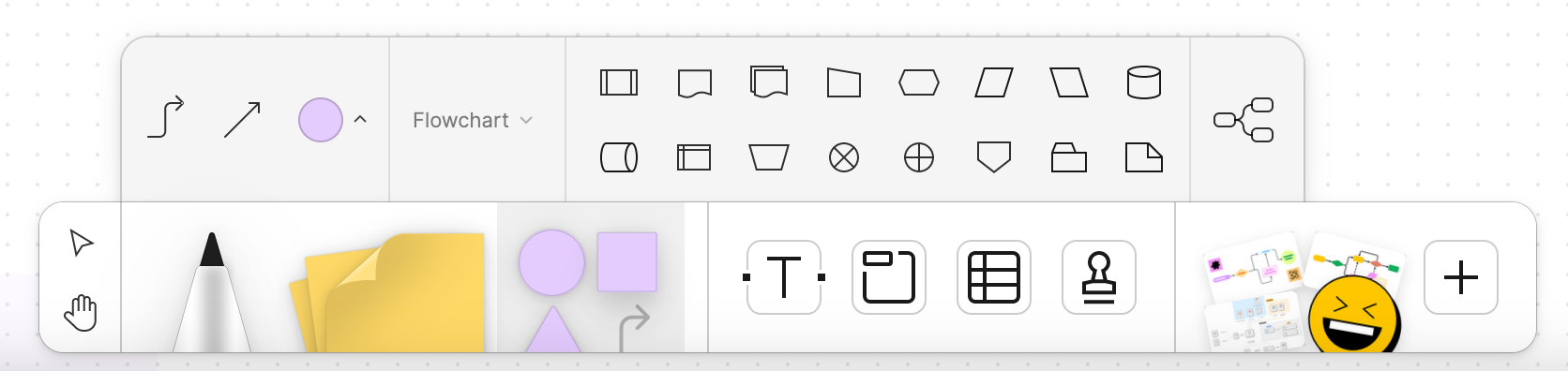
- Shapes section appears very limited. No chevrons which is a pretty common shape used in timelines, nor is here anything related to flow charts. The arrows selection is a bit surface deep, although I understand that you can theoretically create any type of line using the capabilities hidden within the last two options. I would have liked to see more influence from FigJam here where creating lines between elements is exceptionally seamless. To put this another way, I think what FigJam gets so well is it makes reasonable assumptions about how you want to use a shape, and how you want to "link" them with lines or arrows.
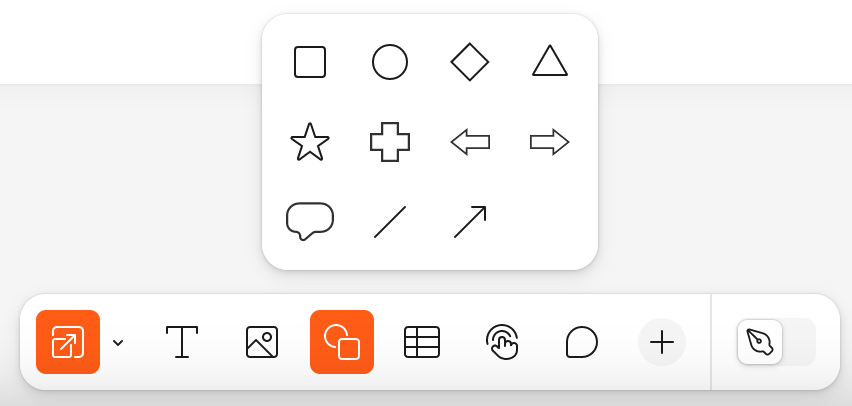
Maybe Figma Slides can lift the shapes implementation from FigJam?
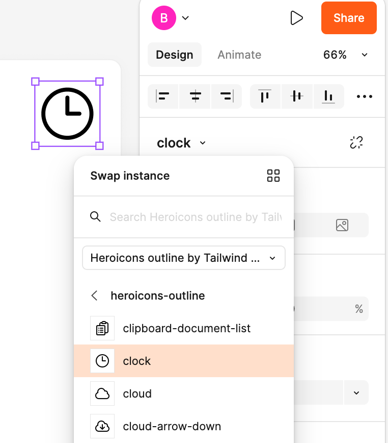
- On the topic of shapes, the built in shapes like Heroicons from Tailwind is awesome, although it doesn't look like you can modify the shapes outside of size (could there be an "explode" option?), and the contextual menu appears to not match what the "shape" is. For example, including an icon shows a slider for "corner rounding" which only applies to a border on the icon, yet a border isn't included by default. Should that menu be conditional and only render once a border is enabled? A visual cue in the right sidebar on what "layer" in the shape you have selected might be useful, since the default after inserting an icon (in this use case at least), relates to the border rather than the icon.
- "Font size" should probably be included "above the fold" ("show details"). As I've venture this is one of the most common options. The real-time hover-to-see change of font size is really nifty, although I wish there was a bit more inspiration from core Figma that used a sliding scale so you could move sizing freely. Using non-descript font sizes in standard increments looses a bit of its value when the canvas itself has no ruler or sizing.
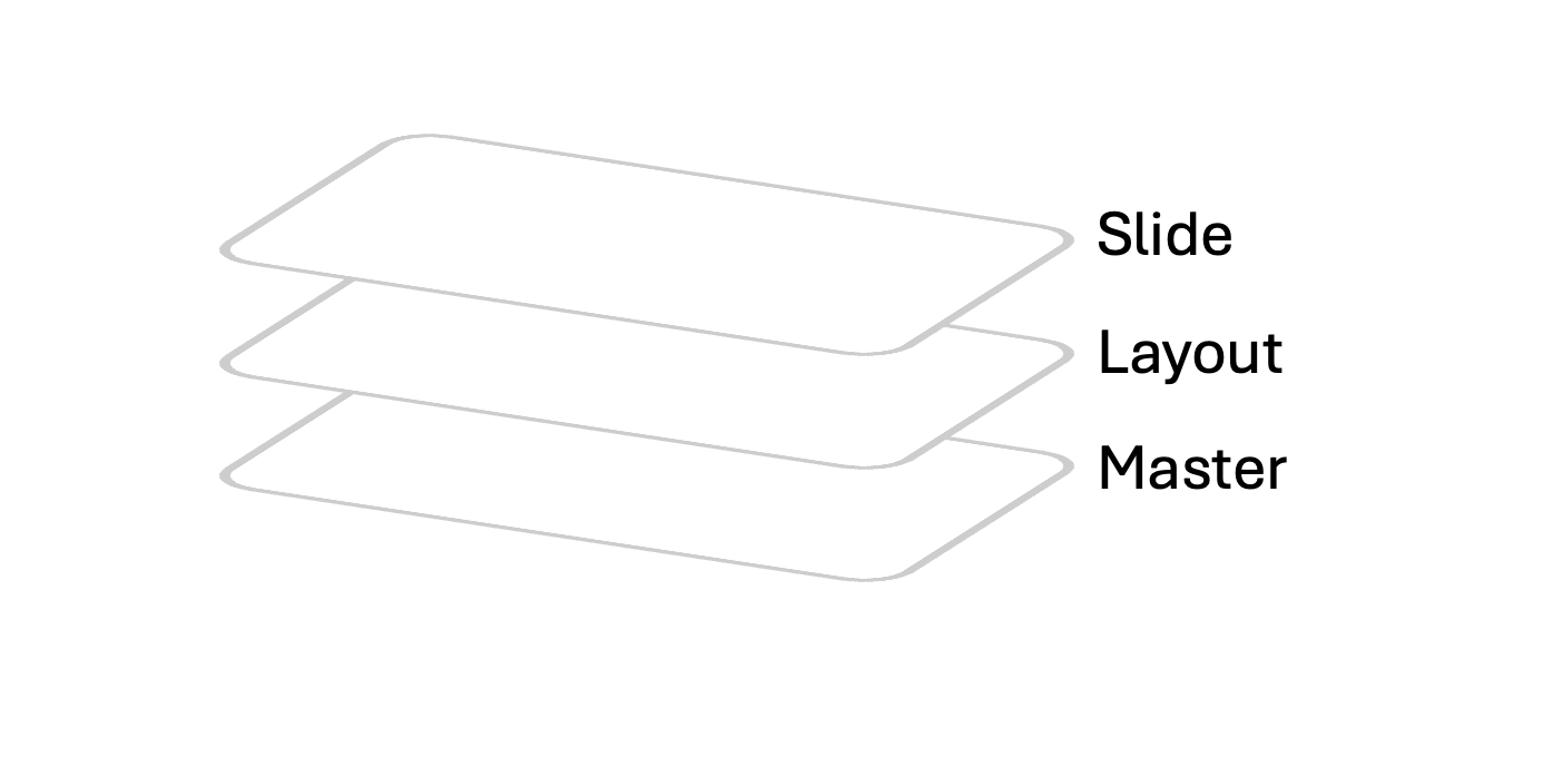
- There doesn't appear to be even basic "master" or "layout" slide types. "Templating" only seems to cover background color, font, and text colors, although it looks like you can allow entire slides to be treated as templated slides. It's also (reasonably) gated behind organization or enterprise plans, which doesn't bother me. Perhaps this is purposeful, I understand the concept of layouts and masters can often be overkill for creating presentations, but then this is also juxtaposed to a presentation tool built from a design platform like Figma. Maybe there's a simpler implementation here? I would like to see core elements of slides locked that create a more rigid structure for adoption and help maintain brand standards.
- Why is presenting in a new tab by default? This could be interesting if you wanted to preview something in a different window, but unlike coding, most slide building is WYSIWYG which defeats the purpose of "hot reloading" which theoretically you could do with this setup.
- Exported slides appear to include "rounding" on the frame. This is notable if you have a non-white background, you end up with a bit of rounded-ness. Just a bug, hopefully an easy fix.
- I haven't been able to find an option to mark slides as "hidden" - useful for both presenting and exporting. Every meaningful presentation I've ever made or been a part of has had a a series of "draft" or different versions of slides. I suppose I could move all the slides I'd prefer to be hidden into their own swimlane, but then I have to move the slides out of the order they might actually appear it. It also makes exporting exceptionally cumbersome since I need to physically delete the slides I don't want in my PDF, then export, then "undo" the delete.
- No charts/ graph generation tools. Not much to say here, just something that you might expect, even a basic implementation. I have more thoughts here in the Opportunities section. Overall, I don't think this is a huge issue because I think most "above average" instances of data visualization happen in a fit-for-purpose tool like Looker or Tableau, so you're really just talking about inserting screenshots.
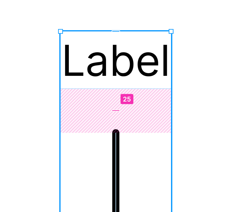
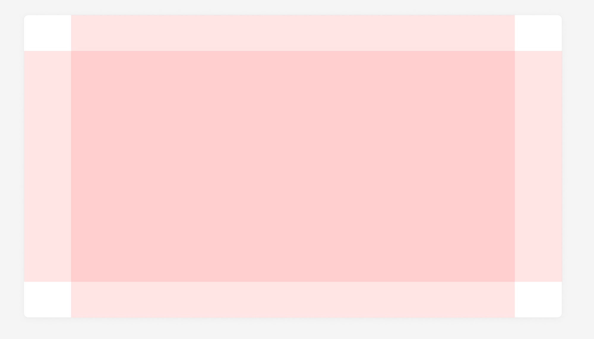
- How is the layout grid defined? This is the default below. To my eye, this is too much padding in both directions. It doesn't appear customizable. Also this visual style of grids, while explicit in terms of knowing where you are, particularly if you're zoomed in, because of the color, it may hinder your ability to "visualize" a finished slide with the deep red overlay. I would venture most usage of this feature would be quickly toggling it, which I think is probably the wrong metric to be tracking.
- Pasting images seems awkward currently. As a caveat, I'm using Firefox in my testing, but for whatever reason, when you paste an image, you first get a mini grayed out "Paste" in a menu that renders right where your cursor was. After a half second or so,
Pastebecomes clickable. Then your image is inserted. Feels like more steps than necessary.

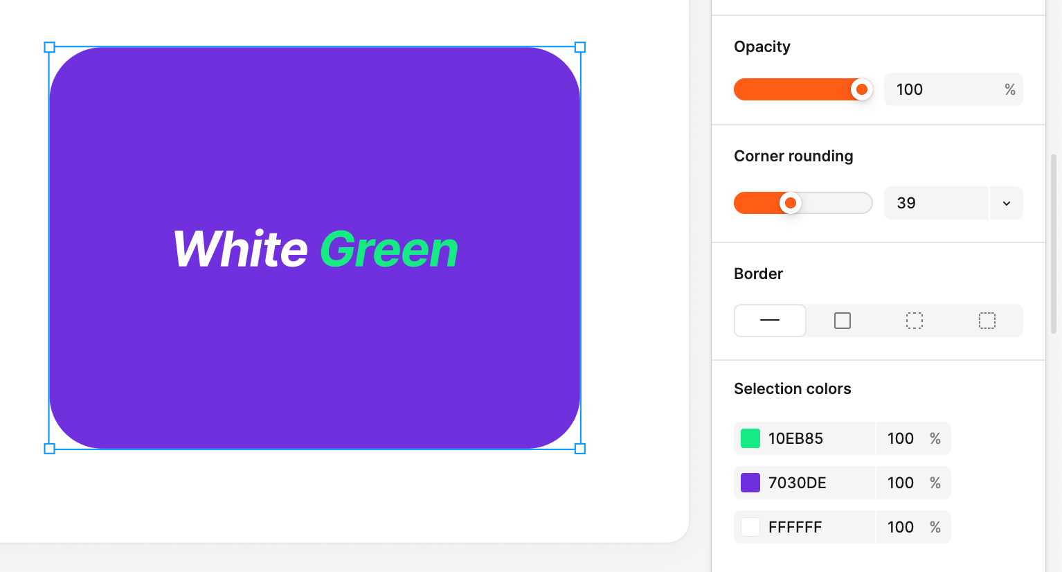
- The "Selection Colors" part of the sidebar doesn't seem to have any context around where the colors come from. For example, I created a shape and changed the color of the text in the middle to white and green. The "selection color" accurately shows the three colors in play, but has no context as to what part of the shape they are responsible for. This is perhaps a bad example, because I would have liked to see basic direction that identify what colors are attached to. In this case I can visually see the purple is the background, but you can imagine a much more detailed shape, you might be playing a game of guess-and-check to get to the color you're looking for.
Borderhas its own section in the sidebar butFilldoesn't? How aboutText?
In this example with a default table, there are 4 colors reflected. In this case, the black probably refers to the text color, but as there is no text, I can't verify this visually. And the last two colors seem strongly like they could both be the gridlines. Seems like there should be contextual sidebar menus that cover tables with Grid, Fill, Text, and maybe even Cell.
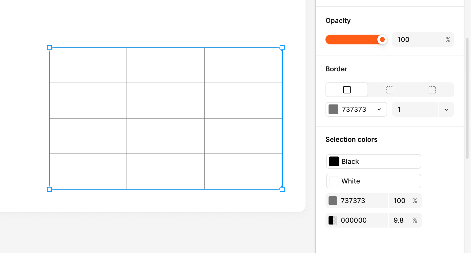
- On the topic of tables, there appears to be no ability to "merge" (or split) cells. This is particularly meaningful since there also isn't an ability to change the color of individual lines of a cell. For example, you can't individually set the "bottom" of a row to a different color or thickness.
- Tables appear to have rounded corners in all cases. While I generally agree with this in most cases, I think it's an oversight to not make this a toggle, or a slider like you see when using shapes.
Opportunities:
No particularly order, just a few things that came to mind.
Slide Nesting
Related to my first strength of presentation layouts, it feels like there's more opportunity here related to nesting. This is a bit derivative of how I'm building out slide hierarchy with SlideCub, but the idea (in my mind) is that every slide can either be a parent, child, or sibling. The advantage of this approach is you remove the concept of an "appendix". Everything is either its own section, a sub-section, or a deep-dive of a previous slide.
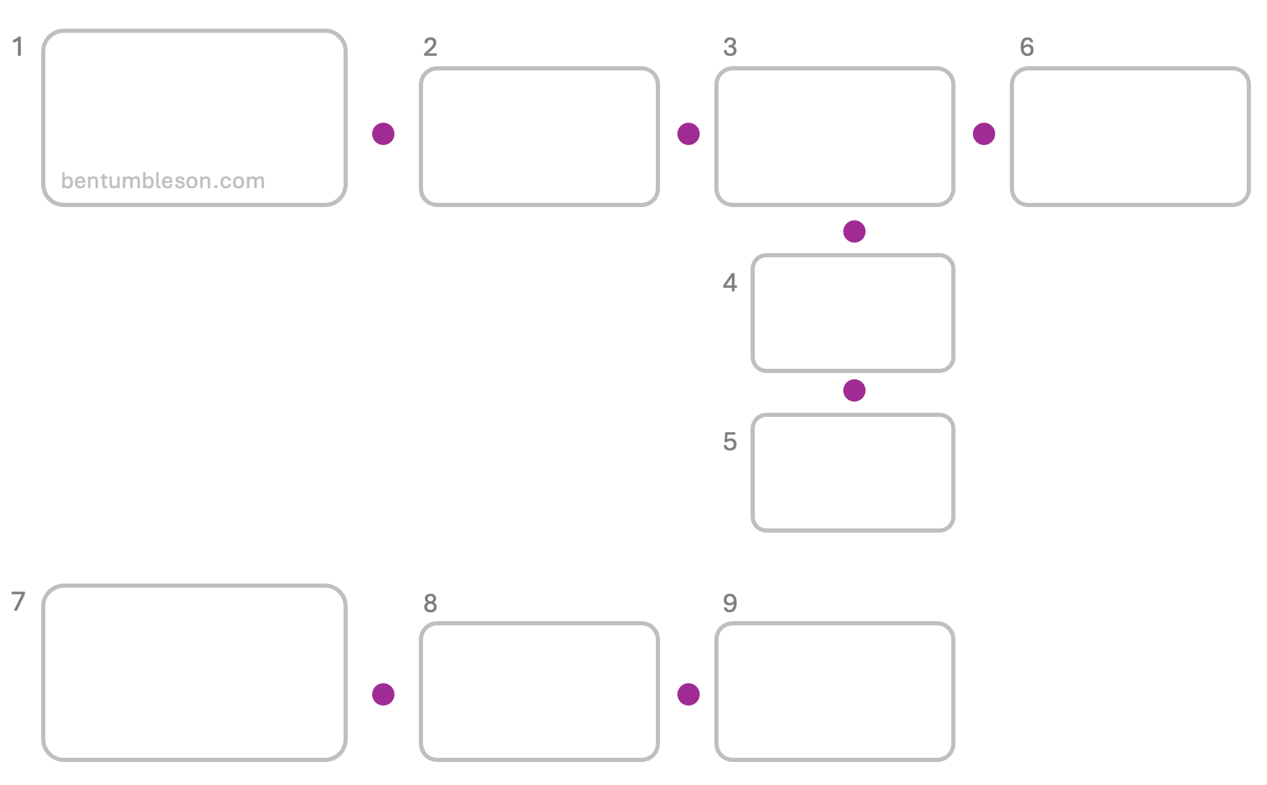
This allows you to create levels of granularity really naturally. Pitching to your engineering team? They'll want to see all the details. Showing this to your C-Suite? Probably skip those details the first time around, but it's still the same deck.
Cursor Chat while Presenting
Particularly in virtual contexts, when there is an "internal" vs "external" audience, it's very common (in my experience) to have the team presenting create a small Slack chat off to the side. I would love to see "cursor chat" still active on the "notes" slide while presenting. Better than keeping a slack chat open to have an internal discussion!
FigJam integration?
I was hopeful that the "live interaction" tab would allow me to integrate FigJam diagrams, but alas. Almost every FigJam diagram I have worked on related to sales, marketing, or product is inevitably screenshotted or exported to PNG and copied into a slide deck. The flaw of this approach is the someone will end up pinning a comment wanting a change on the diagram which they don't have access to (since it's simply an image at this point), and then someone will need to jump back into FigJam to update the diagram.
Merging the "whiteboard" of a FigJam board could be huge, in the same way it looks like integrating prototypes is a core feature. I'd need to do more thinking if you want to just recreate some of the FigJam tools directly inside the Slides tool, or if you just want a seamless integration where a diagram stays in sync to a slide, maybe even going as far as to make sure its properly scaled to fit in a container as well as make sure the font size is readable.
Figma "Analysis" - data visualization
Building off the weakness of not having any ability to generate basic charts (think bar chart, line chart, pie chart, etc.)... it feels like this an opportunity that exists somewhere between Figma Slides and FigJam. "Figma Analysis"? We need something that converts raw text into clean diagrams/ charts. RawGraphs is an excellent open source implementation of this idea.
Might also be a natural extension of the "live analytics" getting built. For example, if you take a big survey or poll throughout a presentation, you might want to slice/ dice that data, especially if you could extract metadata about that user or action (e.g. department, seniority/ title).
A minimal implementation of this might be a "smart" import from tools like Looker and Tableau. Since I'd generally consider Figma Slides to be the best equipped to work with raw vector shapes, there's some interesting opportunities to do SVG exports from those tools directly into Figma Slides. Little bit of AI and you could "hook into" screenshots and do things like rewrite labels or change the font size to fit the medium that is a slide.
Smaller things
- Some of the actions you take in the UI trigger a mini notification in the bottom (awesome), but others that are async in nature, don't trigger a notification so it's not always obvious that the command worked - particularly when you do it via a keyboard shortcut. For example,
Copy as PNGtriggers a small notification, butCopy Propertiesdoes not. - The "shuffle" styles is an interesting idea, but it feels like this is only useful once. Once you have a style "picked", you probably aren't changing color palettes dramatically between slides. I'd also venture that any deck based on a corporate template would already have colors defined, so you might not even want to shuffle.
- Too many useful options from "Object" are tucked into the "Figma" menu rather than contextually available in the right side bar after selecting a slide - particularly the
Bring to FrontandSend to Backoptions. I'd love to see a smaller menu in the right hand size bar with these organizational options. Particularly if there is "extra" space above the canvas, you could even bring a horizontal contextual menu in play. - The "Comment" icon on the bottom is the only action that seems to trigger its own unique "sidebar" menu. For what it's worth, this is a great menu, but I would argue addressing comments is more important than animation, so why does animation get its own tab next to "Design"? This feels like a different flow than the rest of the UI.
- "Shapes" almost certainly needs a default keyboard shortcut. If you borrow the nomenclature from Google slides, everything on a slide is either a shape, image, or table, so I'd like to be able to jump straight to that. Interesting some of the shapes themselves have keyboard shortcuts, so maybe this is already solved? It seems to me we might want to remind a user that all of the shapes (lines, rectangle, ellipse, etc.) are indeed derivative of a base "shape" class - this would provide familiarity with menus and related options for styling.
Threats:
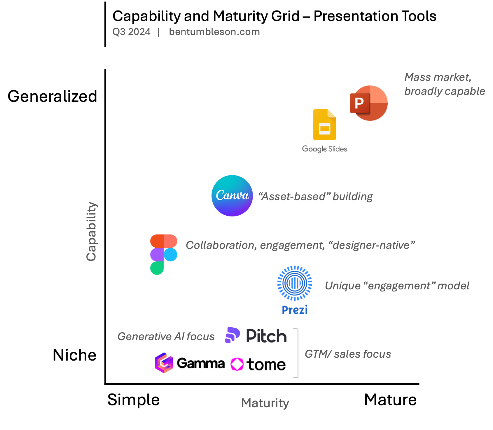
I suppose you really have to define competitors here before we can tangibly think about "threats". My belief that Figma saw success in growing their market beyond designers with FigJam, and may wish to lean into that more as they build out a more comprehensive suite of "work management" tools. If true, this puts this Figma Slides moreso on the track of a "generalist" set of presentation tooling.
Both Google and Microsoft (representing Google Slides and PowerPoint respectively) would largely be considered "matured" products at this point in time, in that the remaining investment you see from both of them is on the fringes. The past many years has been Microsoft catching up with Google on collaboration - something Google historically dominated. There's some interesting stuff coming from both parties in the space of AI and helping generating content (whether that be text or actual layouts), but I haven't seen anything meaningfully deployed into production. This is where smaller players, like Gamma, Tome, and Pitch to a lesser degree are leaning into a "AI-first" approach.
Canva is a bit of an outlier, similar to Figma in many ways that they were able to build atop their existing platform. Canva doubles down into their template and "library" system, which is less so from Figma.
Prezi is the last major player I'd list. Still very niche - the main reason one would choose Prezi is simply the engagement that comes from macro zooming in and out of a massive canvas.
So the main threat I see is that if Figma is trying to be mass market, they have a "feature parity" gap to close. If they double down into AI as a differentiator, they're putting themselves in a ring amongst many small (albeit well funded competitors). Seems to me that Figma's strength is leaning into its design roots in pursuit of a mass-market tool. This is where, I believe, there has been the least amount of innovation, in terms of how content is organized on a page, aligned to a grid, narratives are cohesively built, etc.
Conclusion
I'm excited. Although Figma isn't a tool I work in every day, I've become accustomed to the robustness and power of the platform as a design tool. FigJam was a brilliant addition to the portfolio, and I see Figma moving in the right direction building their own ecosystem of tools that empower builders.

Member discussion: